
The Rise of Gradient Logos | Why They’re Popular Again
For years, logos leaned toward minimal flat silhouettes, solid colors, clean lines and simplicity. Yet in 2025, something bold, dimensional and expressive has returned gradient logos. What once felt like a 2000s design trend is now dominating modern branding again. From tech startups to lifestyle brands, gradients are reclaiming the spotlight and this comeback is far more intentional than a nostalgic revival.
Today, brands want to be seen, remembered and emotionally felt in a digital environment saturated with visuals. Gradients provide depth, movement, light and emotion everything a static brand mark often cannot convey. As a leading Custom Logo Design Agency, we’ve watched gradients evolve from basic color blends into powerful design systems used for storytelling, identity building and modern brand expression.
Before understanding why gradient logos are trending again, we must understand how they’ve changed and what makes them different today.
What Exactly Is a Gradient Logo?
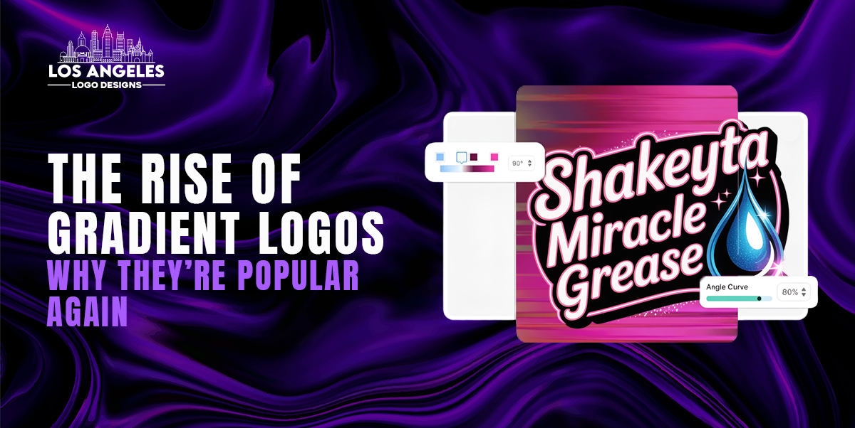
A gradient logo uses two or more colors that blend seamlessly into one another. But today’s gradients are far beyond simple color transitions. Modern logos use:
- Soft multi-tone blends
- Duotone illumination
- 3D-depth gradients
- Neon or luminous fade-outs
- Layered transparency and motion-based shading
This shift has transformed gradients from decorative elements into strategic branding tools. When crafted by a skilled designer or a Corporate Logo Design Agency, a gradient becomes more than a color effect it becomes part of a brand’s personality.
Why Gradient Logos Are Popular Again
The resurgence isn’t accidental it’s driven by major shifts in how brands communicate visually. The rise of digital first branding, mobile devices, AR/VR and animated media has given gradients new purpose and value.
1. Gradients Allow Emotional Storytelling
Colors have emotional weight gradients multiply that impact.
Instead of one tone conveying one feeling, gradients allow a spectrum of meaning.
- Blue to purple → Trust evolving into creativity
- Yellow to orange → Optimism blending into excitement
- Black to red → Power merging with passion
Brands today must express who they are quickly. Gradients make that emotional communication significantly stronger.
2. They Stand Out in Crowded Digital Spaces
Flat logos sometimes disappear in feeds, app menus, product listings or mobile screens. Gradients add brightness, glow and dimension that attracts the eye instantly a critical advantage in branding.
This is why many tech and media companies updated their visuals into more vibrant gradient palettes. Visibility wins relevance. Gradients win visibility.
3. Modern Color Trends Are Driving the Comeback
Designers are embracing chromatic palettes inspired by light, neon, holographic textures, metallic blends and nature. The industry is shifting toward modern logo design trends that feel alive, multi-layered and immersive. Gradients fit perfectly within this direction.
Brands want to feel contemporary gradients communicate that effortlessly.
4. Gradients Pair Perfectly with Animation
This is one of the biggest reasons they’re rising again.
When gradients move, shift or transition, they feel alive. With animation driven branding growing rapidly, gradients complement motion design naturally.
This is why many companies choose Animated Logo Design motion amplifies the effect of gradient visuals, creating cinematic brand identity moments.
The Benefits of Gradient Logos
A gradient logo is not just trendy it is strategically powerful when executed well. Here is why businesses are leaning toward them more than ever:
- Higher Visual Memorability
Humans remember unique visuals faster. A distinctive gradient makes a brand mark more recognizable especially online.
- Depth & Dimension
Gradients add realism and three dimensionality, making logos feel tactile, rich and layered.
- Stronger Digital Appeal
On screens, gradients emit vibrancy in a way flat logos rarely achieve. They glow, shimmer and catch attention perfect for social media and web branding.
- Versatility Across Media
When designed by experts, gradients adapt well across print, digital, product packaging and motion graphics.
- They Showcase Brand Personality
Bright? Calm? Futuristic? Organic? Gradients visually express tone and personality instantly.
A good gradient doesn’t just look attractive it communicates identity.
Why Modern Brands Prefer Gradients
The demand for gradient based brand identity systems is soaring globally. Companies want branding that:
|
Old Logo Expectations |
Modern Logo Expectations |
|
Simple, flat, static |
Dynamic, dimensional, expressive |
|
One meaning |
Multi layered storytelling |
|
Works in print only |
Dominates screens + motion |
|
Safe & minimal |
Bold, memorable, future ready |
Brands today don’t want to blend in they want presence. Gradients offer exactly that.
As the Best Logo Design Company In California, we see gradients becoming core visual identities for:
- Tech startups using neon blends for futuristic energy
- Wellness brands using soft gradients for serenity and balance
- Retail brands using bold color transitions for memorability
- Media brands using animated gradients for engagement
It’s more than design it's strategy.
How Gradient Logos Strengthen Digital Branding
Most interactions now occur on screens. Your logo must perform instantly, whether it appears as a tiny mobile icon or a full landing page hero visual. Flat logos don’t always translate with impact gradients do.
1. Social Media Branding Boost
Scrolling feeds are noisy. A gradient logo cuts through that noise. Color transitions create movement even without animation, prompting clicks, engagement, saves and shares.
2. Better UX Visibility
Gradients guide the eye. They create visual hierarchy in web layouts, making experiences intuitive and enjoyable.
When paired with a Brand Design Agency, gradients evolve from decoration into an interaction tool.
3. More Powerful Brand Recall
Consumers remember colors more than shapes. Using gradients increases memory retention because the eye registers multiple tones instead of one.
People may not remember a flat logo’s shape but they remember that vibrant blue to violet fade.
Choosing the Right Gradient Style for Your Brand
Not every gradient fits every business. The right blend depends on you’re:
- Industry
- Personality
- target audience
- emotional messaging
- long term brand vision
Some gradient approaches include:
|
Style |
Best For |
Example Feel |
|
Soft two tone |
Wellness, skincare, consulting |
Calm, balanced, natural |
|
Bold multicolor |
Media, entertainment, youth brands |
Energetic, modern |
|
Neon or electric |
Tech, gaming, future industries |
Digital, luminous, bold |
|
Metallic gradient |
Luxury, automotive, corporate |
Premium & strong |
|
Animated gradient |
Digital first brands |
Dynamic, alive, immersive |
A Professional Logo Design Agency ensures the gradient tone aligns authentically with the brand’s voice not just aesthetics.
Why Work With a Professional Instead of DIY?
Gradient logos are highly technical. Without expert color mapping, gradients can:
- Print incorrectly
- lose clarity when scaled
- band or pixelate
- look outdated instead of modern
- lose meaning rather than enhance it
A professional avoids all of these issues.
As a top tier Corporate Logo Design Agency, we design gradients using industry accurate color profiles, multi-layer tonal grading, scalability formats and animation ready structures. The result? A gradient that looks flawless everywhere from business cards to LED billboards.
DIY tools can apply gradients, but they cannot strategize them.
Only experienced designers can transform gradients into identity systems.
Final Thoughts: Gradient Logos Aren’t Just a Trend | They Are the Future
In 2025 and beyond, branding is no longer static. It’s living, expressive, colorful, responsive and emotionally charged. Gradient logos represent this future perfectly bold enough to stand out, smart enough to communicate meaning and flexible enough to adapt to animation and digital media.
Brands grow flat visuals don’t always grow with them. Gradients do.
If you want a logo that feels modern, memorable, future ready and deeply brand aligned, Los Angeles Logo Designs is the team to build it with. We don’t just design logos we design visual identities built for recognition, emotion and evolution.
Let’s design a gradient that doesn’t follow the trend…
It becomes the trend.
